![[css] Input Animation, Styled-Components로 바꿔서 사용하기, input selector](https://img1.daumcdn.net/thumb/R750x0/?scode=mtistory2&fname=https%3A%2F%2Fblog.kakaocdn.net%2Fdn%2FQWoo9%2FbtrPJ3nnDp2%2FpxRONYd24ksbqVNtD49yx1%2Fimg.gif)
export const GameInput = styled.input`
  transition: all 0.8s ease-in-out;
  &:focus {
    cursor: pointer;

    ${GameImg} {
      transform: scale(1.2);
    }

    ${GameTitle}::after {
      opacity: 1;
    }
    ${PlayBtn}::before {
      opacity: 0.6;
    }
    ${PlayBtn}::after {
      opacity: 0;
    }

    ${GameLike} {
      opacity: 1;
    }
  }
`;
styled.div 를 styled.input으로 바꾸면 focus 했을 때 다른 요소들에게 영향을 주지 못한다.
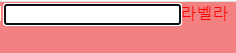
<S.Modal>
        <input></input>
        <label>라벨라벨</label>
      </S.Modal>
이렇게 만들어서,
export const Modal = styled.div`
  width: 300px;
  height: 300px;
  background-color: #f38181;
  font-family: "montserrat", sans-serif;
  font-weight: 500;
  color: #fff;

  input:focus + label {
    color: red;
  }
`;
input과 label을 감싸고 있는 태그에서 선택자를 잡으니까 됐다.
스타일 컴포넌트로 바꾸면 안되는 건 아닐지 걱정이 됐다...
export const NameInput = styled.input``
export const InputLabel = styled.label``
그래서 스타일 컴포넌트로 만든 뒤에
${NameInput}:focus + ${InputLabel} {
    color: red;
  }
이렇게 적용하니
적용된다!
https://stackoverflow.com/questions/23153914/possible-to-style-other-element-on-focus
Possible to style other element on :focus?
Is it possible to style another element on :focus of a specific element? Something like: input:focus #header { display: none; } I tried doing that but it didn't work.
stackoverflow.com
어찌저찌 비슷하게 따라했는데 label에 for가 안 붙는다.
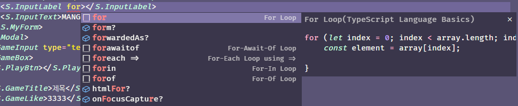
이 for만 뜸...
오! htmlFor을 쓰면 된다.
리액트에서 for는 htmlFor
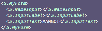
그리고 구조를 잘못 짠 걸 발견하고 다시 수정했는데
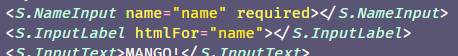
<S.MyForm>
          <S.NameInput name="name" required></S.NameInput>
          <S.InputLabel htmlFor="name">
            <S.InputText>MANGO!</S.InputText>
          </S.InputLabel>
        </S.MyForm>
export const MyForm = styled.form`
width: 30%;
position: relative;
height: 60px;
overflow: hidden;
${NameInput}:focus + ${InputLabel} + ${InputText} {
transform: translateY(-150%);
font-size: 14px;
left: 0px;
color: #fce38a;
}
${NameInput}:valid + ${InputLabel} + ${InputText} {
transform: translateY(-150%);
font-size: 14px;
left: 0px;
color: #fce38a;
}
${NameInput}:focus + ${InputLabel}::after {
transform: translateX(0%);
}
${NameInput}:valid + ${InputLabel}::after {
transform: translateX(0%);
}
`;(+ 저 focus랑 valid를 합치는 법을 모르겠다. 그냥 , 로는 안됐다...)
이번엔 InputText에 효과가 먹지 않았다.
이건 한 겹까지만 효과가 먹는건가?
export const MyForm = styled.form`
  width: 30%;
  position: relative;
  height: 60px;
  overflow: hidden;

  ${NameInput}:focus + ${InputLabel} ${InputText} {
    transform: translateY(-150%);
    font-size: 14px;
    left: 0px;
    color: #fce38a;
  }

  ${NameInput}:valid + ${InputLabel} ${InputText} {
    transform: translateY(-150%);
    font-size: 14px;
    left: 0px;
    color: #fce38a;
  }

  ${NameInput}:focus + ${InputLabel}::after {
    transform: translateX(0%);
  }

  ${NameInput}:valid + ${InputLabel}::after {
    transform: translateX(0%);
  }
`;
이렇게 수정하니까 된다. 다른 부분은 + 를 뺀 것 !
css + 연산자는 그 태그 옆에 있는 어쩌구를 선택하는 거라서 형제자매요소만 가능한가보다.
사실 잘 모르겠다.ㅎㅎ...
어쨌든 드디어! 했다... 어째선지 세시간 정도가 걸렸다.
전체 코드
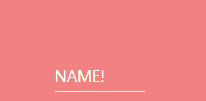
// JSX
<S.Modal>
        <S.MyForm>
          <S.NameInput autoComplete="false" name="name" required></S.NameInput>
          <S.InputLabel htmlFor="name">
            <S.InputText>NAME!</S.InputText>
          </S.InputLabel>
        </S.MyForm>
      </S.Modal>
export const NameInput = styled.input`
  width: 100%;
  height: 100%;
  color: #fff;
  padding-top: 18px;
  border: none;
  background-color: #f38181;
  &:focus {
    outline: none;
  }
`;
export const InputLabel = styled.label`
  position: absolute;
  bottom: 0px;
  left: 0px;
  width: 100%;
  height: 100%;
  pointer-events: none;
  border-bottom: 1px solid white;
  &::after {
    content: "";
    position: absolute;
    bottom: -1px;
    left: 0px;
    width: 100%;
    height: 100%;
    border-bottom: 3px solid #fce38a;
    transform: translateX(-100%);
    transition: all 0.3s ease;
  }
`;
export const InputText = styled.span`
  position: absolute;
  bottom: 0px;
  left: 0px;
  padding-bottom: 5px;
  transition: all 0.3s ease;
`;

export const MyForm = styled.form`
  width: 30%;
  position: relative;
  height: 60px;
  overflow: hidden;

  ${NameInput}:focus + ${InputLabel} ${InputText} {
    transform: translateY(-150%);
    font-size: 14px;
    left: 0px;
    color: #fce38a;
  }

  ${NameInput}:valid + ${InputLabel} ${InputText} {
    transform: translateY(-150%);
    font-size: 14px;
    left: 0px;
    color: #fce38a;
  }

  ${NameInput}:focus + ${InputLabel}::after {
    transform: translateX(0%);
  }

  ${NameInput}:valid + ${InputLabel}::after {
    transform: translateX(0%);
  }
`;
export const Modal = styled.div`
  width: 300px;
  height: 300px;
  background-color: #f38181;
  font-family: "montserrat", sans-serif;
  font-weight: 500;
  color: #fff;

  display: flex;
  flex-direction: row;
  justify-content: center;
  align-items: center;

  /* input:focus + label {
    color: red;
  } */
`;
https://codepen.io/webcrafterscz/pen/WLxzyQ
Input Animation CSS
...
codepen.io
'프론트엔드✏️ > 개인공부' 카테고리의 다른 글
| [Styled-Components, Emotion] 컴포넌트 가져와서 일부만 수정하기(상속) (0) | 2022.11.25 |
|---|---|
| [react-youtube] 재생목록 있는데 그 안에서 랜덤 재생하게 하고 싶어. (0) | 2022.11.04 |
| [css] grid는 어려월... repeat(auto-fill, minmax(285px, 1fr)); (0) | 2022.10.24 |
| [react-slick] 페이지 번호, 커스텀 화살표 (0) | 2022.10.21 |
| [emotion, styled-component] 이거에 마우스 올렸을 때 저거의 가상요소가 변했으면 좋겠어! (0) | 2022.10.20 |