![[공통 컴포넌트,css]글자수 체크하는 Input창, x 초기화 버튼 Input, 테두리 겹치는 부분](https://img1.daumcdn.net/thumb/R750x0/?scode=mtistory2&fname=https%3A%2F%2Fblog.kakaocdn.net%2Fdn%2FcQxXDt%2FbtrLx1Gvv7s%2FaqlEFKvKsoNPQHvUJywoK0%2Fimg.gif)
728x90
반응형
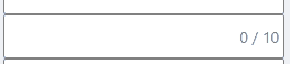
글자수 체크하는 Input창 만들기
import { useState } from "react";

const CheckInput = ({
  text = "체크 Input",
  typeClassName = "",
  sizeClassName = "",
  ...props
}) => {
  const [length, setLength] = useState(0);

  const getTextLength = (event) => {
    setLength(event.target.value.length); // event.target.value의 길이로 설정
    if (event.target.value.length >= props.maxLength) { // 자음 하나씩 더 입력돼서 11/10 이렇게 뜨길래 설정함
      setLength(props.maxLength);
    }
  };
  return (
    <div className="checkInputBox"> // position : relative; 와 width 설정
      <input
        className={`checkInput ${typeClassName} ${sizeClassName}`} // checkInput만 써서 했다.
        onChange={getTextLength}
        placeholder={props.placeholder}
        maxLength={props.maxLength}
      />
      <span className="textLength"> position : absolute;
        {length} / {props.maxLength}
      </span>
    </div>
  );
};

export default CheckInput;
.checkInputBox {
position: relative;
width: 255px;
.checkInput {
border: 1px solid gray;
border-radius: 2px;
width: 255px;
height: 40px;
padding: 5px;
letter-spacing: -1px;
&:focus {
outline: none;
background-color: #7c9ce70e;
transition: 1s;
}
}
.textLength {
position: absolute;
right: 5px;
top: 10px;
color: gray;
}
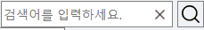
}초기화 버튼 있는 Input 만들기
import { useRef } from "react";

const XInput = ({
  text = "검색어를 입력하세요.",
  typeClassName = "",
  sizeClassName = "",
  ...props
}) => {
  const inputRef = useRef<HTMLInputElement>(null);

  const onClickX = () => {
    if (inputRef.current?.value) {
      inputRef.current.value = "";
    }
  };

  return (
    <div className="inputWrap">
      <input
        className={`XInput ${typeClassName} ${sizeClassName}`}
        onChange={props.onChangeInput}
        placeholder={text}
        maxLength={props.maxLength}
        type="search"
        ref={inputRef}
      />
      <button className="btnClear" onClick={onClickX}></button>
    </div>
  );
};

export default XInput;
.inputWrap {
position: relative;
height: 30px;
display: inline-block; // 원래 div는 block인데, inline-block으로 만들었다.
input {
padding-right: 30px;
height: inherit;
border: 1px solid gray;
background-color: white;
&:focus { // 이 부분은 없어도 된다. (누르면 배경색 변하는 효과)
outline: none;
background-color: #7c9ce70e;
transition: 1s;
}
}
.btnClear {
position: absolute;
top: 0;
right: 0;
width: 30px;
height: inherit;
background: url(https://cdn-icons-png.flaticon.com/512/2549/2549969.png)
center center no-repeat;
background-size: 50%;
border: none;
outline: none;
cursor: pointer;
}
}
div 테두리 겹치는 현상 없애기
자식 선택자 이용, display: flex 등 table이 아니여도 가능
https://lynmp.com/ko/article/nt811c9dc5ge
Grid template 테두리(border) 중복 적용 안되게 하기 - LYNMP
Grid template 를 이용해 테이블처럼 표현할 때 border 가 중복 적용되는 걸 피하는 방법에 대해 정리해봤습니다.
lynmp.com
export const ScanDataDetailTop = styled.div`
  display: grid;
  grid-template-columns: repeat(4, 1fr);
  border-left: 1px solid #000000;
  border-top: 1px solid black;
  > div {
    border-right: 1px solid black;
    border-bottom: 1px solid black;
  }
`;
border-collapse는 display가 table일 때 되는 것 같다.
좌우로만 늘어진 한 줄 짜리라면, 전체에 border를 주고, 안에 있는 div에 각각 border-left를 주고 그 div중 first-child에만 border : none; 하는 방법도 있다.
728x90
반응형
'프론트엔드✏️ > 개인공부' 카테고리의 다른 글
| [react-csv] react 엑셀 파일로 내보내기 (0) | 2022.09.07 |
|---|---|
| [공통 컴포넌트,css] select - defaultValue 빈값으로 설정 (0) | 2022.09.07 |
| 공통 컴포넌트 만드는 중 (0) | 2022.09.05 |
| [react-query] 리액트 쿼리 (0) | 2022.09.01 |
| [알고리즘] 최소직사각형 (0) | 2022.08.20 |